

A green dashboard is reassuring. When every requirement in Google Postmaster Tools says “Compliant,” it is tempting to close the tab and move on.
But what happens when campaign performance tells a different story? Fewer people click. A reliable audience stops responding. Revenue falls, even though the compliance checks still look healthy.
Google Postmaster Tools v2 is useful for investigating Gmail deliverability, provided we are clear about the questions each report can answer. Meeting sender requirements, receiving positive user feedback, and measuring campaign performance are connected. They are also different things.
The practical question is how to read those signals together before deciding what to change.
One scope limit matters from the start: Postmaster Tools reports on mail sent to personal Gmail accounts, including @gmail.com and @googlemail.com. These reports do not describe delivery to custom-domain Google Workspace mailboxes.
What “Compliant” tells you
The first screenshot shows eight compliant checks, covering authentication, From: header alignment, encryption, spam rate, DNS and unsubscribe handling. Below them, Deliverability analysis also shows a positive assessment.
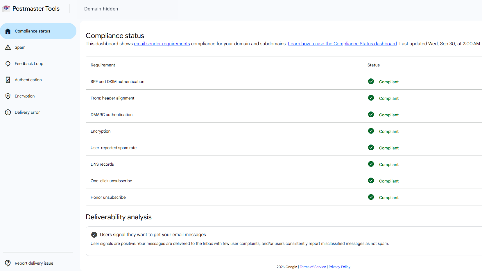
Figure 1. An anonymized example with all displayed requirements marked Compliant and positive recipient feedback. This screenshot does not demonstrate a deliverability problem.
These are encouraging results. They support the conclusion that the displayed checks are being met and that the analysis is positive for the reported data. They do not establish an inbox placement percentage for every campaign or recipient.
The Compliance status dashboard uses a rolling average across several days and a dataset that differs slightly from other reports. Google advises allowing up to seven days for compliance changes to appear. A green status should therefore be read alongside the daily charts.
Google’s email sender guidelines cover both infrastructure and sending practices. Authentication, valid DNS and secure transport matter, alongside wanted mail and easy unsubscribe. Passing authentication cannot establish whether a particular promotion is useful to the person receiving it.
For a marketing team, that distinction matters. A compliant program still needs decisions about frequency, targeting and content. Those decisions should reflect how subscribers respond.
Read Deliverability analysis as a diagnostic signal
The message in Figure 1 says: “Users signal they want to get your email messages.” That is a useful positive signal. It should inform your assessment without becoming permission to expand sending indefinitely.
Google’s Postmaster Tools API documentation describes several possible diagnostic reasons, including insufficient volume, delivery errors, non-compliance, elevated spam rates, low interaction and positive or negative user feedback.
The API’s elevated-spam-rate reason is defined as a rate above 0.1%. This gives senders another reason to investigate well before 0.3%.
The API distinguishes these reasons, but it does not provide the full filtering formula or the weighting of each recipient action. We should avoid turning a short assessment into a claim that we know exactly how Gmail scores a sender.
My practical approach is to record the assessment alongside the date and recent sending changes. If the assessment changes, I want to know what changed in the email program around the same time.
Did we introduce a new acquisition source? Increase promotional frequency? Include an older audience? Change the balance between notifications and bulk campaigns?
Those questions turn a dashboard observation into something the team can investigate.
Below 0.3% does not mean there is nothing to improve
The second screenshot comes from a different sending domain. It is a separate example, not a continuation of the first domain’s results.
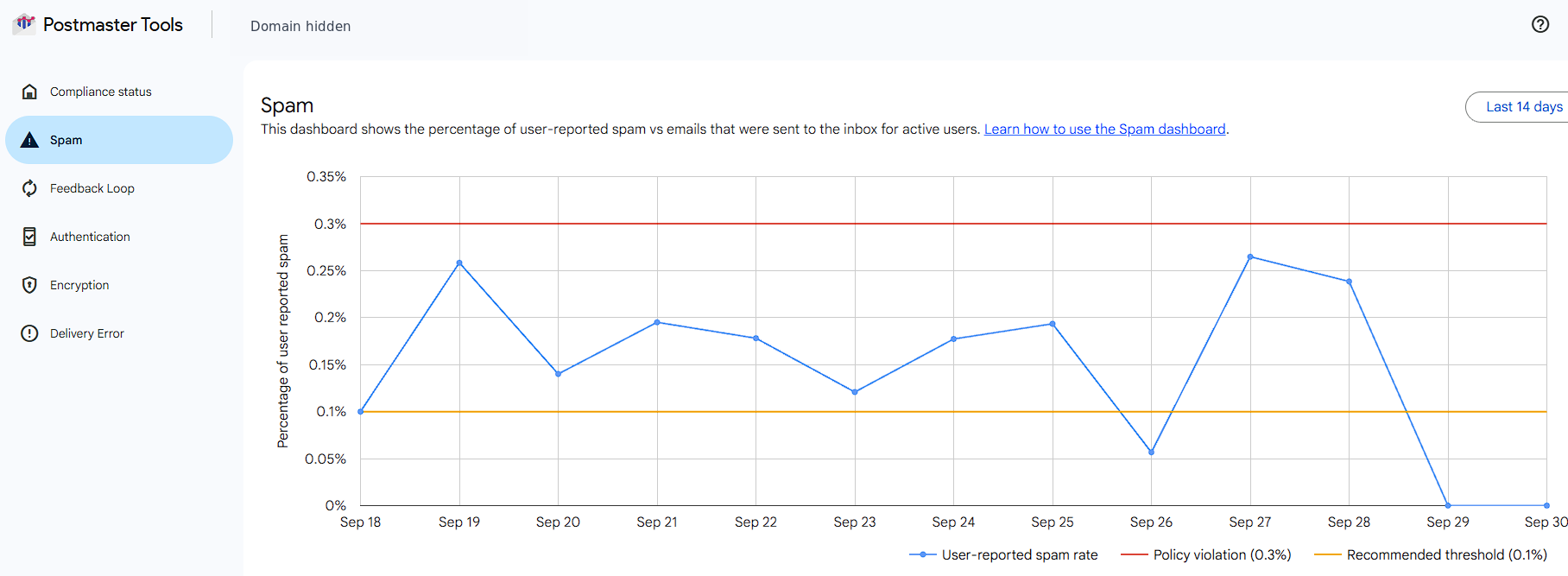
Figure 2. A separate anonymized example. Most populated daily rates exceed the orange 0.1% line while remaining below the red 0.3% line.
Google’s sender guidelines FAQ recommends keeping daily user-reported spam rates below 0.1% and preventing them from reaching 0.3% or higher. It also states that the effect is graduated and that rates above 0.1% already negatively affect inbox delivery for bulk senders.
That makes 0.3% a poor operational target. A team repeatedly seeing 0.2% should investigate the complaints, even if the chart never crosses the red line.
I would start with the audiences and campaigns behind the higher days. Check whether complaints follow a particular offer, acquisition source or increase in frequency. Google’s Postmaster Tools FAQ recommends adding a Feedback-ID header and using Feedback Loop to investigate campaigns. Without a campaign breakdown, the daily domain-level chart alone cannot identify which send caused a spike.
Check for delayed or missing data before reading the trend
For this specific screenshot, the sender confirms that reporting had not caught up for the final two dates. Those zero points should be treated as unavailable data. This explanation comes from the sender’s monitoring context; a screenshot alone cannot distinguish delayed data from a measured zero rate.
Google says dashboard updates usually arrive within 24 hours but can take longer. Separately, low volume can cause data to be withheld for privacy. A missing point may therefore have another explanation besides delay. Compare dates with usable data and revisit recent days as reporting updates.
A low reported spam rate still needs context
Google’s spam-rate definition concerns DKIM-authenticated mail delivered to engaged recipients’ inboxes and then reported as spam. Mail moved from spam through a recipient’s “not spam” action also counts toward inbox delivery. The denominator is not your total sent volume.
Google warns that automatic spam placement can leave the reported rate deceptively low. A low rate alone cannot establish good inbox placement.
This is a separate diagnostic point, not an explanation for Figure 2’s delayed data. Zero complaints can be a good result. There is no reason to aim for a non-zero complaint rate as proof of inbox delivery.
Before celebrating or escalating a sudden drop, I would check whether comparable traffic was sent, whether reporting has caught up, and whether clicks and conversions changed at the same time.
A rise in complaints can sometimes accompany a period of stronger inbox reach and higher short-term revenue, even when the reported spam rate crosses 0.3%. A campaign may reach more interested buyers while also reaching more people who consider it unwanted. The commercial gain may be real, but the higher complaint rate is a warning. It does not, by itself, prove better inbox placement.
Even an isolated spike deserves attention. Google states that rates of 0.3% or higher have a greater negative impact on inbox delivery. Repeated or sustained spikes can compromise compliance and future deliverability, making those immediate gains harder to sustain.
If the spam rate subsequently drops sharply, check whether performance improved or fewer messages are reaching the inbox. Google documents increased automatic spam placement as one possible explanation for a sudden fall to zero. Once reporting delays and changes in sending have been accounted for, a falling complaint rate alongside weaker clicks and conversions should prompt further investigation.
The goal is to explain the movement rather than assign it a meaning from its direction alone.
A practical workflow for investigating Gmail deliverability
When results weaken, I suggest keeping a short investigation log. Each entry should connect an observation, a possible explanation and the evidence needed to test it.
- Define the affected traffic. Identify the campaign type, audience and sending domain. Compare similar sends instead of mixing a welcome flow with a broad promotion.
- Align the reporting periods. Postmaster uses UTC. Align your reporting timezone and exclude dates whose data is still unavailable before comparing daily numbers.
- Read actual delivery responses. Look at deferrals, rejections and their SMTP codes. Google’s FAQ provides examples of authentication and alignment errors. Use the response you received to guide the investigation.
- Compare recipient and business outcomes. Review clicks, conversions, unsubscribes and complaints alongside delivery data. A revenue decline alone does not establish a filtering problem; the offer, audience or website may have changed too.
- Review recent marketing decisions. Write down changes in frequency, acquisition, targeting and content. These are useful hypotheses to test, rather than automatic explanations.
- Make a focused adjustment. For example, test a lower frequency with the affected segment. Define what improvement would look like and when you will review it. Changing several things at once makes the result harder to interpret.
Compliance status aggregates the primary domain and its subdomains. Keep your own traffic breakdown available when diagnosing an individual stream.
Use the dashboard to support a marketing decision
If the evidence points to a technical failure, fix it. If the problem follows a particular audience or sending pattern, marketing needs to be part of the response.
A useful outcome might be a smaller test audience, a revised subscription promise, or a frequency change for one segment. When the evidence is healthy, it might support a controlled expansion instead.
This is the connection explored in Email Deliverability vs Email Marketing: deliverability data should help shape marketing decisions, while marketing results give those diagnostics practical context.
Postmaster Tools is most useful when it leads to a better question and a measurable next step. “Everything is green” is an observation. Understanding what to do next takes a little more work.